KeplerGL is a very efficient tool to visualise large scale spatial data and interact with it on-the-fly. In this project, KeplerGL is used to visualise the results of our tripSender tool.
The blue dots represent agent homes, with higher intensity for more population density and lower intensity for less number of agents in the model. The colour on the agents represents a trip purpose.
This is a demo for the toy model and hence is not completely calibrated.
-Trips are forced to end at the source on the (n-1)th trip,
-data on agents below the age of 16 is not accounted for.
-The choice model for assigning the OD matrix is quite simple (haversine distance - closest neighbour)

Below is a real-time demo of how the trip sender function works. All data is fetched on-the-fly, other than the personas containing daily agendas of agents. This too could be fetched remotely.
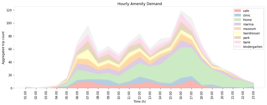
The daily trip purposes can be aggregated and plotted on a 24-hour area plot.

A breakup of the amenity demand is also possible

The same information can be drilled down into, as a barplot
Checkout the GitHub pages for this project
Checkout the ReadTheDocs documentation.
The Repo is still private and will be available after publication.